
Three women, and every colour between them
The mark, and what the client himself wrote about it.
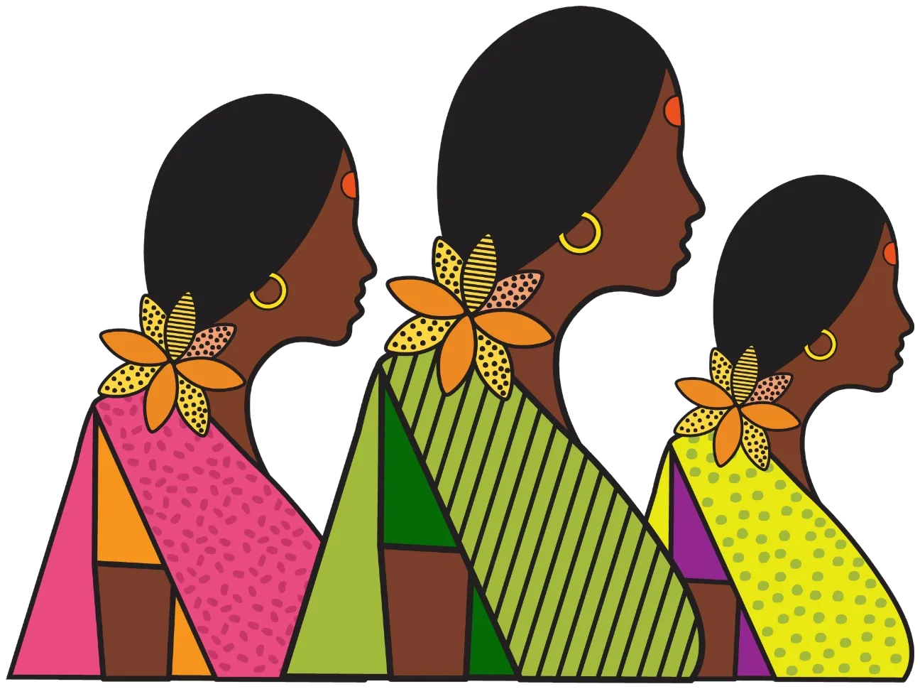
The focal point of the logo is three gracefully illustrated women, each in vivid traditional dress, standing for the many colours of India. They stand together: the cultural diversity and the harmony that define the country.
Three is not an accident. It signifies unity, and it stands for the traditions, languages and customs that have run together to make India — the colours on their clothes chosen for the vibrancy and the movement that go with them.
The typography carries the rest: Rang Travels — explore the colours of India. Taken together the mark is an invitation: a journey that promises a kaleidoscope, in a country that keeps changing colour as you cross it.

rang · noun · Hindi · colour
Travel with us, and see where the name comes from